Innovating sustainable fashion
Roles
UX Research, UX/UI Design, Product design
Duration
3 weeks
Tools used

Overview
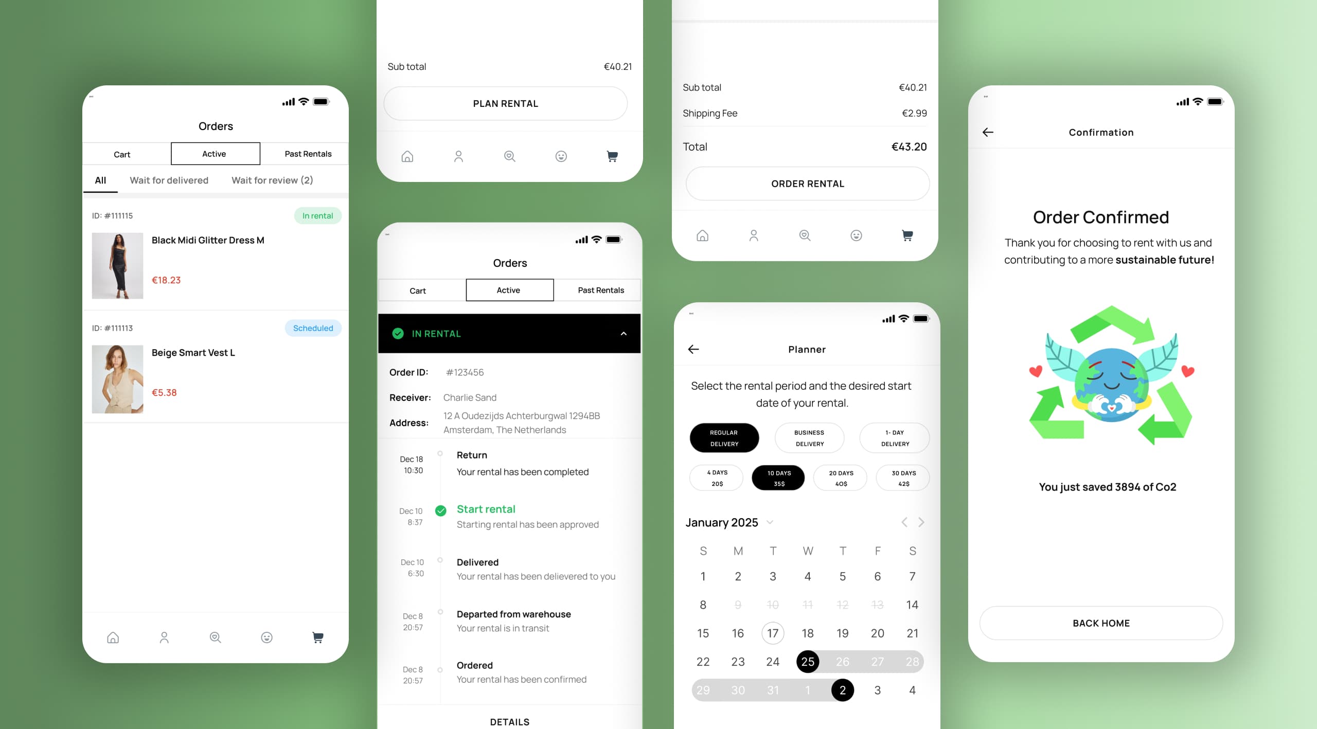
Rent-a-Trend is a clothing rental app for young adults who want fast fashion's affordability and variety without the environmental cost. This case study covers the research, prioritization, and design decisions behind it, from an initial pricing hypothesis, through the trust barrier that overturned it, to the features built to solve for that instead.
Problem
Young adults are fast fashion's biggest buyers, and increasingly aware it's environmentally costly, yet that awareness hasn't changed buying behavior. Rental apps exist as an alternative, but adoption stays low.
The question: what's actually stopping people from renting instead of buying?
Process
Discover
- Desk research
- Graffiti walls
- Structured interviews
- Values analysis
Define
- Empathy map
- Affinity map
- Difficulty matrix
Ideate
- Co-design:
- Bull's eye
- What if?
- Moodboard
- Competitive analysis
Design
- User flow
- Prototype
- Hi-Fi Designs
Problem definition
1. Desk research
Existing literature pointed to two possible adoption barriers for clothing rental: cost and hygiene trust. Which one actually mattered was still unclear; that question shaped every research method that followed.
Testing awareness in the wild
2. Graffiti wall
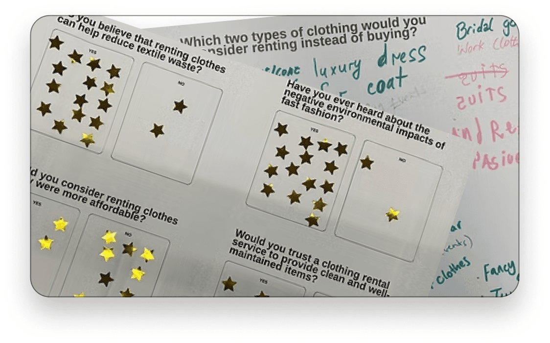
Two anonymous graffiti walls gathered honest, low-pressure feedback: one inside a fast-fashion store in the Netherlands to gauge awareness and rental willingness, another with international students to see which clothing categories they would actually consider renting.
Gathering insights
3. Structured interviews
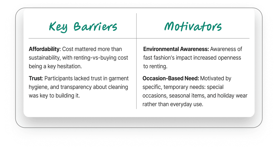
Structured interviews followed up on the graffiti wall findings, digging into the “why” behind the numbers. Thematic analysis surfaced two competing forces: affordability mattered, but hygiene and trust in a stranger's worn clothing mattered more.
Turning barriers into design direction
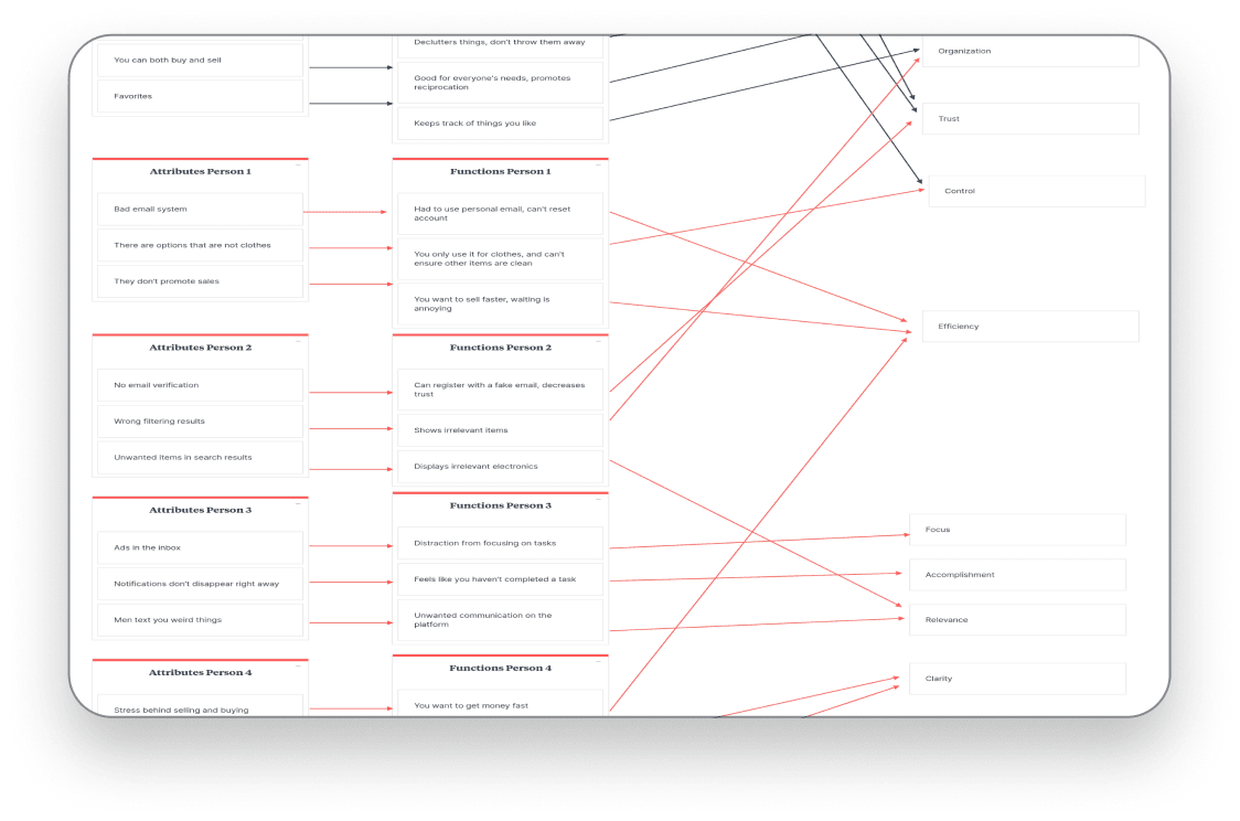
4. Value analysis
Interview themes were mapped against user motivations to separate what people said they wanted from what was actually stopping them. Trust and hygiene outweighed cost, the finding that redirected the roadmap toward transparency features over price-driven ones.
Understanding users
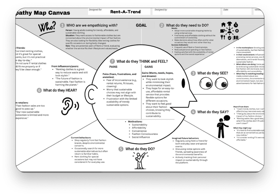
5. Empathy map
Interview data was mapped across what users said, thought, felt, and did, surfacing the emotional friction behind their answers, like discomfort with wearing someone else's clothes first. That's what pushed hygiene transparency ahead of price-driven features.
Synthesizing insights
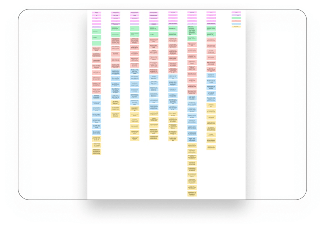
6. Affinity map
Research findings were clustered into recurring themes, producing a shortlist of possible features, sustainability tracking, cleaning transparency, and rental rewards, ready to be prioritized rather than built on instinct.
Prioritization
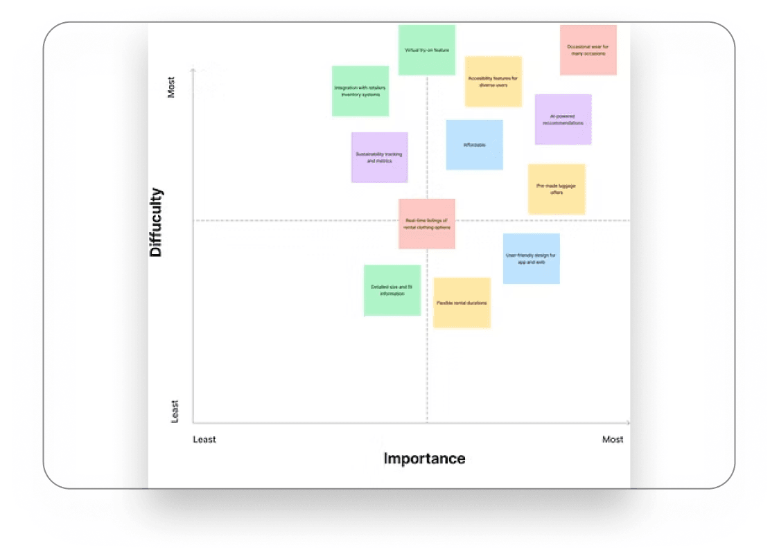
7. Difficulty matrix
A difficulty matrix balanced innovation with feasibility, prioritizing features like cleaning certification and flexible rental terms, while designating complex ones like virtual try-on as a long-term goal.
Filtering potential features
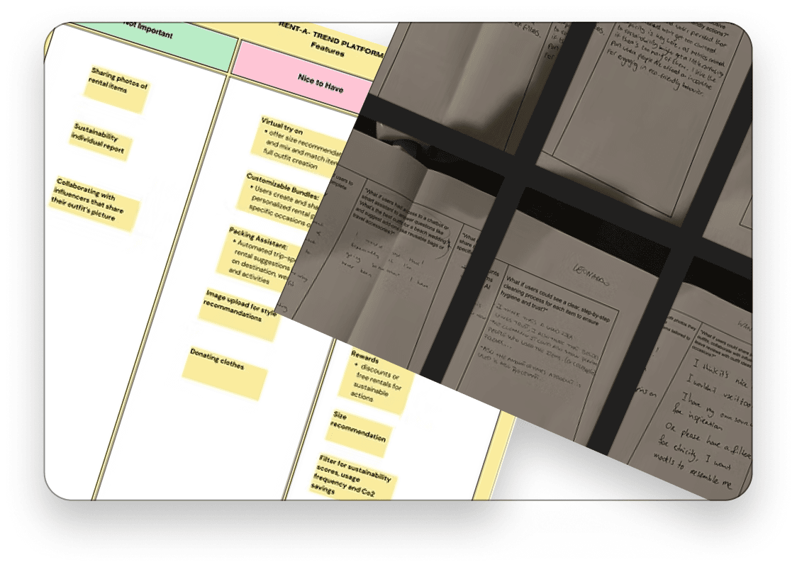
8. Co-design: What if & Bull's eye
Using “What If” scenarios and a Bull's Eye Diagram, participants generated ideas like a transparent cleaning process, tailored rental packs, photo-based recommendations, and an outfit chatbot.
Understanding app content
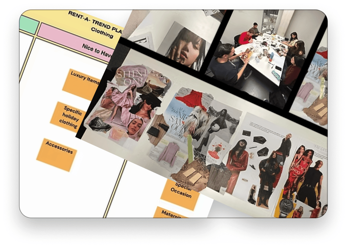
9. Co-design: Moodboards & Bull's eye
Using mood boards and a Bull's Eye Diagram, participants revealed a preference for elegant, sustainable styles blending beauty, glamour, and luxury.
Researching existing solutions
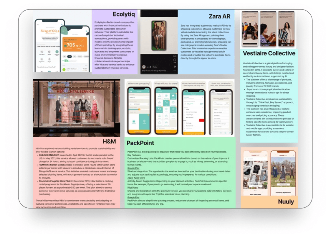
10. Competitive analysis
Research on existing platforms shaped the prototype with proven features: AR virtual try-on (Zara), AI-assisted image search (Google Lens), packing assistants (PackPoint), and a sustainability tracker (Ecolytiq).
From insight to structure
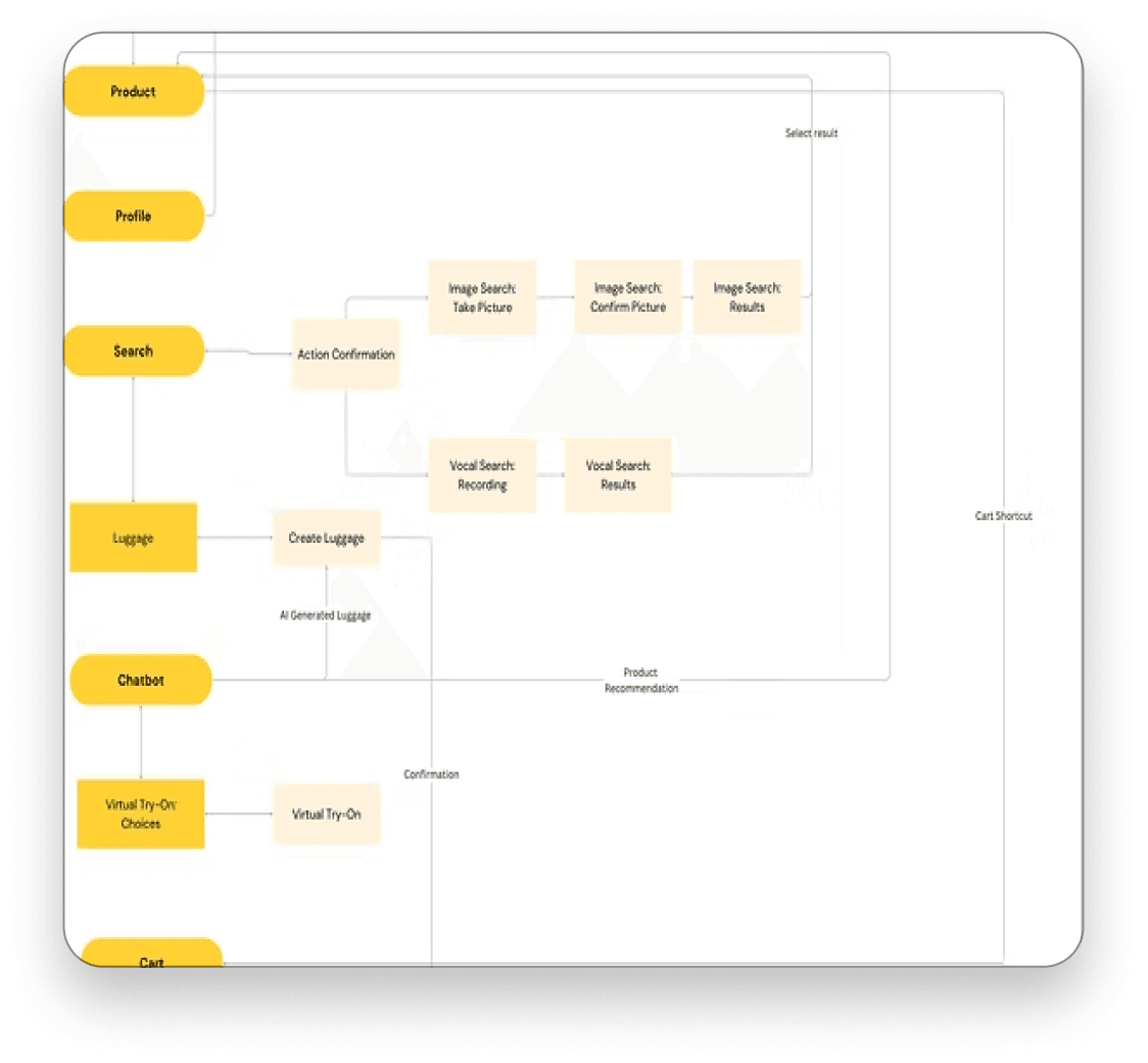
11. User flow
With priorities set, the app's full navigation was mapped end to end, from browsing and rental packs to checkout and return, creating a clear blueprint that outlined navigation across all major sections.
Visualizing the product
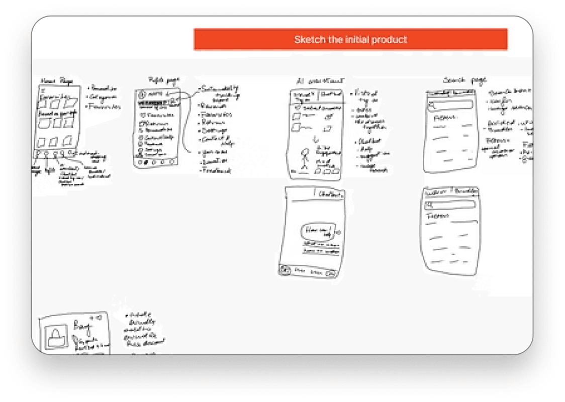
12. Low-fi prototype
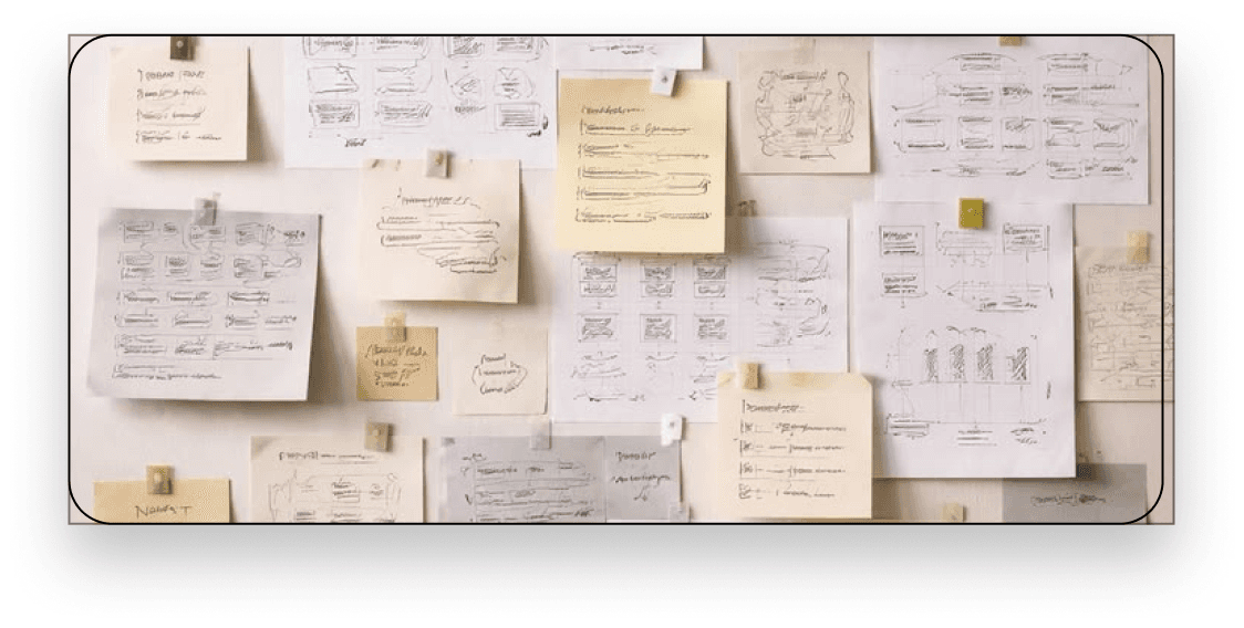
Early low-fidelity sketches translated the user flow into rough screens, enough to test navigation logic and feature placement before investing in visual design.
Problem definition
1. Desk research
Existing literature pointed to two possible adoption barriers for clothing rental: cost and hygiene trust. Which one actually mattered was still unclear; that question shaped every research method that followed.
Gathering insights
3. Structured interviews
Structured interviews followed up on the graffiti wall findings, digging into the “why” behind the numbers. Thematic analysis surfaced two competing forces: affordability mattered, but hygiene and trust in a stranger's worn clothing mattered more.
Understanding users
5. Empathy map
Interview data was mapped across what users said, thought, felt, and did, surfacing the emotional friction behind their answers, like discomfort with wearing someone else's clothes first. That's what pushed hygiene transparency ahead of price-driven features.
Prioritization
7. Difficulty matrix
A difficulty matrix balanced innovation with feasibility, prioritizing features like cleaning certification and flexible rental terms, while designating complex ones like virtual try-on as a long-term goal.
Understanding app content
9. Co-design: Moodboards & Bull's eye
Using mood boards and a Bull's Eye Diagram, participants revealed a preference for elegant, sustainable styles blending beauty, glamour, and luxury.
From insight to structure
11. User flow
With priorities set, the app's full navigation was mapped end to end, from browsing and rental packs to checkout and return, creating a clear blueprint that outlined navigation across all major sections.
Testing awareness in the wild
2. Graffiti wall
Two anonymous graffiti walls gathered honest, low-pressure feedback: one inside a fast-fashion store in the Netherlands to gauge awareness and rental willingness, another with international students to see which clothing categories they would actually consider renting.
Turning barriers into design direction
4. Value analysis
Interview themes were mapped against user motivations to separate what people said they wanted from what was actually stopping them. Trust and hygiene outweighed cost, the finding that redirected the roadmap toward transparency features over price-driven ones.
Synthesizing insights
6. Affinity map
Research findings were clustered into recurring themes, producing a shortlist of possible features, sustainability tracking, cleaning transparency, and rental rewards, ready to be prioritized rather than built on instinct.
Filtering potential features
8. Co-design: What if & Bull's eye
Using “What If” scenarios and a Bull's Eye Diagram, participants generated ideas like a transparent cleaning process, tailored rental packs, photo-based recommendations, and an outfit chatbot.
Researching existing solutions
10. Competitive analysis
Research on existing platforms shaped the prototype with proven features: AR virtual try-on (Zara), AI-assisted image search (Google Lens), packing assistants (PackPoint), and a sustainability tracker (Ecolytiq).
Visualizing the product
12. Low-fi prototype
Early low-fidelity sketches translated the user flow into rough screens, enough to test navigation logic and feature placement before investing in visual design.
Main features
High-Fidelity Designs
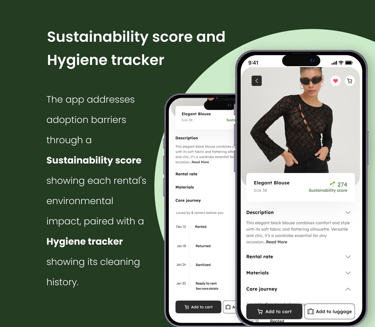
- Sustainability score and Hygiene tracker
- The app addresses adoption barriers through a Sustainability score showing each rental's environmental impact, paired with a Hygiene tracker showing its cleaning history.
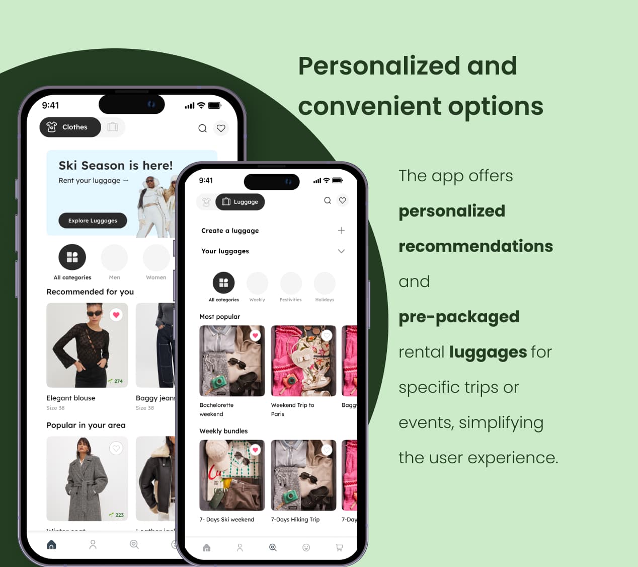
- Personalized and convenient options
- The app offers personalized recommendations and pre-packaged rental luggages for specific trips or events, simplifying the user experience.
Results
Rent-a-Trend was shaped and stress-tested by research at every stage. Here's what's confirmed, and projected if launched:
Barrier confirmed by research:
88.2% of respondents already knew fast fashion's environmental impact, but willingness to rent barely tracked with affordability (35.3%). Trust and hygiene, not price, were the real barrier, and that reshaped the feature roadmap.
Positive feedback:
Informal usability testing on the hygiene tracker screen showed a strong signal: 13 of 15 testers said seeing the cleaning history made them feel more reassured about renting.
Projected conversion impact:
If launched, the hygiene tracker and cleaning-history transparency are projected to lift checkout conversion: they directly target the #1 reason testers are hesitant to rent.
Target retention metric:
Repeat rental rate, not first-time signups, would be the clearest signal that trust was actually established: success means people come back, not just try it once.